Friday, July 9, 2010

The little things that count.

I was watching TV the other day (I know that it would be much smarter sounding if I said, 'I read in an article', but who am I kidding, I'm a HUGE TV junkie!), and this terrible commercial interrupted a highly pleasurable episode of The Golden Girls- RUDE!- to inform me of the state of the economy. As if I didn't already know. But just as I was about to flip over to my other favorite channel... the other channel that seems to only ever air GG episodes... the annoyingly monotone man on the commercial began to talk about how, in this sort of economy, we begin to realize that what's really important in life are the little things... and then I flipped to that other channel, ha! But even through a riotously hilarious exchange between Dorothy and Sophia (she called her a 'nasty little person' and SHE IS... LOLOLOL!!!... she really IS sucha nasty, little, person... LOLOL!!! ROFL... it STILL gets me when I think about it!!!) I kept hearing that dull-voiced man drone on about "the little things." And it made me think, what about me? I mean, WHAT ABOUT me??? Like... really. Here we are, in the worst economy pretty much ever, and I'm pushing people to buy like nothings changed. I am the worst! For shame!!! And then, Dorothy hit Rose over the head with a newspaper and I came back to my senses. Fewh! Fewh, for us all, am I right?!?!? Of course I am :) Anyway, as that newspaper came down sharply on Roses peroxide drenched head, I realized that THAT IS the power of design. It's all about the little things!!! I'm not pushing product like some dark alley, meth-dealer (besides if I WERE Id be in a much more glamorous locale than some dingy alley- TRUST! But, I don't do that disgust so get your mind out of there and back to what we were talking about!!), what design and moi attempt to do is to alter or redirect the energy of a space and infuse your life with the subsequent positivity- and the avenue through which this is achieved IS by introducing, altering, re-placing, editing, THE LITTLE THINGS!!! Accessories, furnishing, textiles, collectibles, colors... those are the smallest (and often time, therefore forgotten) elements of our living spaces that have the power to affect the way that we feel IN that space. So, what I wanted to do was to show you some examples of little things, that don't cost anything (or very much) but can totally change the way an object feels. Then, Id like to encourage you to walk your own space and think about what little things you can do to increase the positive energy that you feel there.

-1-
Ok, so example numero one is made by this exquisite vintage Buddha (actually Quan Yin) statue. Now without a doubt she is fantastic as is! Duh. But what happens if we give her a blossom to hold and 'toss' one at her feet? She comes to life and really pops! And all by adding a little flower that cost less than $10.00!!! I think bringing her to life is worth that investment.


-2-

A nest is just not cozy without someone to live there. And yes, these are quail eggs (spicy, blue quail eggs, oooh la la!) and no this is not a quails nest. But, they needed a home and this nest needed some life and so voila- perfection for .99 cents each!


-3-


So, photography skills aside (no, I'm never going to get better at that, deal), an ordinary branch is suddenly extraordinary when a few teenie-weenie birdies and paper flowers are introduced. Yes they are are still great on their own, but the size and softness of the material (bird and flower) allow the branches to maintain their sparse feel and visual integrity, but help to keep them from feeling boring, right? Yes J, you are right. Thank you.

-4-

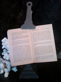
This vintage music/book stand is radness. But, isn't it so much radder when a vintage postcard is layered over the book that it holds?!?!? The correct answer is, yes. Yay!!! I knew you would agree!!! It screams, 'look at me just because!' instead of, 'I'm here... you know, if you wanted to read something, or something.' Snore.


Ok, now (presumably) you get it. Design and creating your space is not only about buying sofas and uber expensive armoires! Sometimes by adding a teenie weenie little birdie, you can bring a whole tree to life! Let's all start appreciating the little things a little more.

-J


Friday, June 11, 2010

Where in the helicopter have I been...?!?!?

Guuurrrl, I don't even know! Ha!!! LOLOLOL!!! The last few weeks have been a psychedelic blur of all sorts of activities, happenings and so on and so forth (well, minus the charm of any trip-educing party favors- I think I'm missing out... blugh!). From wrapping up my spring semester classes (thank baby Jesus and Mary and all the saints, etc) to Birthday weekends to last minute rush-rush clients, I've been a big'ol crazy mess- YES, much more than usual (and yes, that IS so possible- rude!)! But no, I have not forgotten about you. In fact, right now, I should be dealing with other, supposedly more pressing matters, but I likes to think of myself as a free spirit- you know, bills shmills, I need to chat with my peeps right now! Aaaanywho, I thought you might enjoy a teensy weensy peek into one of my recent/current projects. Now before you skip over me and plow through to the pics, WAIT! Allow me to prepare you for what you are going to be looking at. Uh hem. This is Mrs. C's house. It's a lovely house. It has a very sweet yet still quietly sophisticated quality about it. But Mrs. C wanted to give it a twist. She wanted to infuse religious (I know! Can you imagine?!?! Who would EVER want to include various religious elements into their home?!?! CUH-ray-Zeee!) iconography and other found objects into her current space, and create a more time-gathered, layered effect. Now, these pics show you ONLY PHASE ONE of the project. Next phase will include a different dining table and chairs, and then we'll change out the light fixture over the dining space as well as the sconces over the mantle, and then we'll add a second sofa in place of the arm chairs, and then we'll address finishing touches (ie: small tables, custom pillows, and any other accessories). The reason I wanted to show this to you is two fold. First this project wonderfully illustrates how MOST people (in our area at least) are tackling the challenges of (re)designing their homes. The fact is that MOST of us want to revamp. Yet most of us are not comfortable handing a blank check over to a designer and saying 'call me when your done'. So, MOST people (again, now-a-days and in our area) are doing more gradual work. And really, this is a very smart and very easy option. You move at your own pace but still achieve your ultimate goal. In the case of Mrs. C and her goal of a collected and varied mix of goodies, it works nicely because she is allowed the opportunity to see the mix rise, layer by layer and appreciate each piece as it is installed. Secondly, this particular project is a good opportunity to discuss good vs best! In a nut shell, Mrs. C's place was good... but with a pinch of filthy and a dash of gorgeous, it will be BEST!


This is Mrs. C's living room after it was sprinkled with the glamorousness of FG- duh. Prior to FG, there was a HUGE (and when I say HUGE, I mean, GINORMOUS!) square, ebony-finished wood coffee table between the sofa and chairs with a few chotskies scattered about on top; the side table, between the arm chairs, was empty and the mantle was bare save for a fresco-esque painting hanging on the wall above it. So we added an exquisite mossy-green rug to ground the space and built the rest of the concept from there. Because we are introducing a second sofa (to replace the 2 arm chairs) the coffee table needed to be scaled back and less bulky feeling. By incorporating a mirror topped table, we also added much needed light. The previous, almost Old Hollywood or Regency Glam feel of the space/furnishings was tough to make work with her new direction, BUT not impossible. Anyway, like I said, clearly this is NOT THE FINAL PRODUCT, but it is well on its way.


Yes, the sconces flanking the mirror need to be changed, thank you, I know. And yes, the detail on the mantle itself would be better if it just weren't. And yes, the dog is SOOOO CUTE- her name is Tibey!

Remember, she wanted a very dense, layered look- which can rapidly become cluttered feeling. The key is to be neat where you can (ie: piles/stacks) and to create strict and definitive places for everything. Moving it a millimeter to the right or left? No no no, that just won't do! Once you establish an item's particular home in its landscape- there it must remain.


Antique books with splitting spines and newer, hardcover coffee table books make great textured foundations to build on. Plus they warm up the cool mirror, vintage stone Buddha head and small silver flower cup. Lots to see, but it all reads cooperatively, not chaotically.


Again, I know that the detail work on the mantle itself is how do you say.... wrong, but one step at a time! Just look at the accessories woujah?!?! Though you SO cant tell from these pics, the walls are actually a beigey-cream color, so the crisp white coral pops off of them nicely and helped to brighten the potential heaviness of the time stained icons. Also, notice the stratification of stuff! Sea fan behind coral behind icon beside candle or coral behind mirror, behind candle and chalice beside crusifix... its like a visual buffet!


So, as I mentioned, Mrs. C already had lots of her own stuff and wanted to keep much of it (no problem because not too much of it was very bad, no, we can not all say that about most of our things- who are you kidding?) But by adding bits of nature, or old found objects, pieces that might otherwise feel doughty now feel interested and actually work towards the aesthetic goal of the space (although this small painted cabinet is next on my list of "needs to go away's").


Like many of us have, this room is a shared space. The dining table designated the formal eating area. Right now, the current table is wrong. Its too heavy (visually) and too dark. It just brings down the space on every level. Ideally, Id like to see an old (I know, who'd have guessed Id pick something old), lighter wood table. The rusticness of something old will contrast all of the pristine polished surfaces AND help to warm up the space while keeping things light. The chairs should be smaller, simpler and more uniform. And the light fixture, well that's an issue. But for now, the addition of the mirror (which she already had in another room) and the Quan Yin statue, help to break up the darkness and pull up (visually) that side of the room.


None of the pieces are bad. But they don't evoke the feeling that Mrs. C wants her space to. They don't contribute to the aesthetic direction, so they are not best and therefore need to be changed. And, step by step, they will be.


Mrs. C purchased this amazing Portuguese antique cage Santos statue from the Shop months ago and finally was able to see it placed and dressed in her space. The items grouped about her base make this corner very shrine-like which is a feeling Mrs. C loves!


So, yes, I promise to share the pics with you as each new phase is implemented. I will keep you updated and we'll watch the transformation happen together. Yay. xox

-J


Friday, May 21, 2010

That's just how it is!


So there is the piece as shown by the manufacturer and there on the right,
it is on the website of the below referenced bog box- uuuugh!


While I hope never to become one of those people who use their blog as an outlet through which they channel all of their frustrations (no, I prefer to bottle them up and really cherish that pent up, choking feeling that only repressed resentment can cause- I, was raised right!) onto an unsuspecting or wanting audience, today, I must vent. So, for those of you who are fein of heart, now's your chance to point and click your way to another, less uh, saucy online destination. But for those true-blue, die hard Filthy Gorgeous Lifers and ride or die friends, gurl, let's work through this one together! Oh, and one more thing, I honest to goodness had no intention of sharing this today... NONE! I really don't prefer to wallow in negative muck like this... but every once in a blue-polka-dot moon, I get stuck'n'da'muck! Today, I'm stuck. So, just yesterday, while I was in the Shop I met this lovely lady who was looking for a mirrored side table. She told me about one that she had seen recently while at a big box store (who shall remain nameless, but between you and me, their name rhymes with Manthropologie). I told her that we carried lots of them and would be more than happy to send her an email with pics of some of the more popular pieces. So, I promptly began to gather info for her email. Well, long story short, I found her the very piece which she had been admiring at the above-rhymed bog box- it happened to be a piece that we had carried for several years and even showcased on the sale's floor years ago. Now, here's where it gets good: before confirming that I could get the piece for her I decided to do some research, and found that the big box was selling the piece for less than the wholesale cost that the manufacturer would sell the piece to me for!!! Could it be?!?! No! Or so I thought; so I called the manufacturer to inquire. Sure enough, they unashamedly admitted that they produced and distributed the piece for the big box and that no, they would not budge on the price for anyone else even if we had carried the piece longer than the big box had!!! At the end of the day, the big box bought in such bulk that I could not hope to compete with them. Sigh. I sadly recommended that my client purchase the piece at the big box as I could not meet, let alone, beat their price! FRUS-TRATION!!! Well, just let it roll off your back, right? Ummm, easier said than done, especially when this sort of thing is becoming more and more common place. It is both the blessed benefit of Capitalism and the bane of my boutique-existence! While small shop owners toil and sweat to create and inspire, corporate stores shop us for ideas, sources and innovations (I might point out here a store that rhymes with Constipation Shardware's recent 'development' of a 'new look' or another such store that rhymes with Pottyme Marm's constant picking up of 'new product' which just happens to be niche-goods of home boutiques- but I'm not going to even go there, Im... uh.. above it all, ha!). I mean, really? Really, I should be flattered and such. But I'm not- not today anyway. Uuuugh! In a time when retailers have to fight for sales, shouldn't we all be seeking to work together by fostering uniqueness and individuality(?) not 'borrowing' each others vendor list or merchandise mix! And, no, I am not suggesting that I am the only small store owner who has or is experiencing this. But that's exactly my point! This is something that is too prevalent and yet unaddressed. And still, what can be done? And further, what will be the ultimate result? My mind flashes back to a movie I saw as a child where Taco Bell (yes, I'm saying their name... I LOVES a Burrito Supreme, yes ma'am!) was the ONLY restaurant left in the world and people consequently viewed it as 'fine-dining' (some of us already do- but let's talk about that at another time). In a landscape of fewer and fewer mom-and-pops and growing numbers of corporate conglomerates dominating every corner space, are we headed towards a future of less product options and fine-dining served up in steamed flour tortillas? OR, am I just being dramatic? Thoughts? Anyway, after I sent of my sad little email, I spoke to my most FAVORITE person in the whole wide universe, JD. The advise was clear and simple. Don't get distracted and keep on doing what you do best... walking a step ahead of the rest! But... still... I'm exasperated... and vexed... and irritated... and annoyed... and... damn it, I need a Burrito Supreme!

Steamed with frustration,
-J

Friday, April 30, 2010

The latest from the back room.


Doesn't that sound a bit daunting? 'The latest... from the... back room." Dun dun duuuuuhn! And truthfully, pulling together this tiny space has been sort of a horrific experience. I don't need to list the various issues that have come up again, right? You've heard 'em all. But then, after last week's unexpected discovery of inspiration (cheers to the sublimity of Designers Guild!) and my subsequent resurgence of motivation I have been making strides toward the room that I see in my mind's eye... ahhhh and sigh. My bed (for those of you who were wondering) is scheduled for delivery tonight! And gurl, I am giddy with excitement! I cant wait to set'er up and then sprawl out! She has been nipped, tucked, put through a complete overhaul; and after weeks under the saw, she is ready to make her summertime 2010 debut. FIERCE mama! And, the light fixture is finally set to ship at some point in the next week(!!!!) AND, I have help to rehang the crooked TV this weekend... sigh (again)... I loves :) Now on to the next step- FRAMING. Which could be a VERY exciting process. BUT realistically, it's going to be a rough one. Why? Well friends this, actually, is our lesson for today: DON'T LET UNEXPECTEDLY BIG NUMBERS DETERMINE YOUR DESIGN. For our example we are going to use the process of having something framed. I recently took a series of 8x10 photographs in to be framed. Truth be told, I hadn't done this particular thing in YEARS! In fact that last time I was having something professionally framed it was a poster of Paula Abdul (and American Idol was not yet even an itch in an English man's pants- as my god-mother used to say- don't ask me! I don't know what it means either, I just thought it fit well there! Point is that the last time I had something professionally framed was a LONG time ago!)! So, I took them to a local, reputable framer for an estimate. Let me just save my fingers some typing and your eyes several lines of reading and tell you that I ended up going to SEVERAL, other framers before I realized, to have this sort of thing done, I was going to have to pay. Now, hear me: I'm not saying that it's right (or wrong) or that you should just accept the first bid you receive or any of that- what I'm saying is, to have the pieces framed as I wanted them to be (i.e.: a quality job per the vision in my mind's eye) it was not going to be cheap. In fact, I ended up settling on a place here in The WC that charged me nearly $100.00 a piece. ...! Keeping in mind that these weren't custom sized pics (standard 8x10's), mattes, or frames, does that sound expensive to anyone else? Maybe I'm a bigger cheap-skate than Id like to think I am, but in spite of the fact that that was the lowest price I was able to find, it STILL sounded high to me! But now, what were my options? To settle for something that wasn't quite right for the sake of cost? Blugh! Or, to attempt to do it myself? Ha! Or, to refuse to have them framed until the magical (and rainbow haired) framing fairy fell into my lap? Well, surprising as it might be, none of those options seemed acceptable to me. So, I did the only thing that I could- I embraced the reality that some things just cost more than I was aware of and therefore (after a respectable amount of shopping around of course), I selected the best man for the job and laid down my credit card. Now lets tie this all back to me and my room(because that's what it's all about anyway, right? RIGHT!). One of the final remaining pieces of my bedroom project is a series of framed works that will hang together on a wall across from my bed. So, my options (again) are to: embrace the fact that I will not get this particular piece of the room done unless I am prepared to spend more than $10.00 a pop, OR, to attempt to frame them all myself (did I already say, ha!, ?), OR, to wait for that damn framing fairy! Well, I've been waiting for everything else (including the fairy!), and gurl I'm TIRED! So I think Ill do a bit of shopping 'round and then bite the bullet, quit the bitchin and moanin, and gid'er done. YOU, may need to do a bit of shopping, you may need to alter the details to stay in a certain fiscal-ballpark, you might even have to postpone things a bit to afford it, but when it comes down to it, DON'T LET UNEXPECTEDLY BIG NUMBERS DETERMINE YOUR DESIGN. Besides, if you do (and your anything like me) it'll just be a matter of time before you redo what you've done and then you will've paid for the dang project twice!

You know you love me,
-J

Thursday, April 22, 2010

I've got it!!!!!!!!!!!!!!!!!!!!!!!!!!!!!!!!!!!!!!!!!!!!!!!!!!!!!!!!!!!!!!!!!!!!!!!!!!!!!!!!!

From consistently choosing and painting the wrong paint color, to having THE hardest time finding a simple black curtain panel that I finally had to just have some custom made, to ordering a back-ordered light fixture, to (most recently) finding that, after all of the time, money and emotion that I've invested into making my beloved antique bed work, the new Tempurpedic mattress and box spring which I JUST bought for it will not fit into it, I had pretty much had it! I mean, fer realz, HAD IT! Had it, to the point of not wanting to continue. Had it, to the point of wanting to take a lit match to the carpet and closing the door. Had it, even more than my most trying design clients frustrate the very marrow in my bones- it was even more than that sort of had it!!! Gurl... I was through! So, when last we met, I told you that I needed a minute. I needed a moment to myself, some time to regroup and hopefully find a new inspiration. Not that my vision for the room had been shaken or changed. I still knew (know) what the space needs to be (did you really doubt that- come on, really?) but I just needed a new source of inspiration for my own creative stores from which I could tap positive energies when things get... well, as hairy as things have gotten! Well today I'm proud to report that I've finally found a new source of inspiration. And I'm so happy to say that it comes from one of our favorite vendors, Designer's Guild. As I happened upon their newest catalog and through page after page of delicious gor-jiss-ness, I suddenly felt my inspiration reserves begin to swell. Oh the colors, textures, the brilliant mix of stylistic genres- it was literally, sinfully titillating! What can I say? Some people like porn or exotic dancers... me likes a pretty house! So, since I was so thrilled and excited by all that I saw I decided that you too, needed some aesthetic edification. No, no, don't thank me. That's just me, I'm a giver. Now, sit back, relax and take it all in... enjoy this smorgasbord of style... MMMUWAH!

So on it's own I might have said that this floraly patern was just too too, buuuut mixed with contem- porary shapes and textural punches of color, well now, now it's my number one jam!


Clearly color is import- ant here. But that's not the only lesson to be learned Look at the mix of contem- porary and classic... it's really delight- ful!


A word of caution though: there IS someth- ing to be said for having a wall large enough to support so much pattern! So be smart!


I just have two word for you: PINK PLAID!


Feeling, uh, a little blue? UGH!!! I LIVE for this room!!! And you do too, ok?!?! A statem- ment, yes, but so eloqu- ently put!!!


And this one made me shed a tiny tear from the corner of the eyeball of my heart because my soul was smiling so hard when it first gazed upon its sumptuous loveliness!!! Yes, really!


Now go. Off with you! Sashay away... and be inspired.

-J

Friday, April 9, 2010

I've hit the wall...


This is my wall, and gurl(!) Ive hit it! Oh, and btw, love the color doncha?!?!?


well, not literally. I have really delicate bone structure and hitting a wall (any wall) voluntarily would be much too risky an expression of emotion for me to actually engage in. What I'm trying to tell you is that I am frustrated and as a result I'm feeling stumped. Le sigh... and one more, le sigh. Ok, so my room was coming along, but then, all of the sudden, it seems as if EVERYTHING snagged on one problem or another. SERIOUSLY- it's been enough to make me want to just say 'forget it!' and fly on over to Pottery Barn (Ow! That actually hurt my fingers just typing it. Is that normal... hmmm...weird) and say, 'gimme the number 3'! That is how they do it at those stores, right? You know, order by number or combo or something like that? I dunno, point is that I'm FRUSTRATED! (And apparently frustration makes Jonathan a bitchy-boy!) It all started with my beautiful bed (you remember her?). Oh how much I longed for her arrival. I could barely contain myself (yes really! You get excited about your favorite stuff and Ill get excited about mine, thank you very much Judgey Judith!). But then, when at last she finally came, she looked like she had been through a battle. I was crushed... DEVASTATED! Literally, I was almost misty-eyed when I saw her wounds. Hang on... gimme a sec... fewh! Ok, I'm fine. So yes, the shippers had decimated her. SO I sent her off to be repaired. Well if it hasn't been one thing its been another; and here I am nearly a month later and she's still not back!!! And that's just my bed! Then the window coverings were another fiasco all together! Let me just simply say, thank you Marissa over at the Home Depot (yes I did try every independent distributor that I could get a hold of and no, none of them were able to assist me in a timely manner so yes, I was forced to brave the masses and jump into the nightmare of the big HD!) for her patience and consideration- there's a special place in heaven for peoples like you and Ill promise to decorate it fabulously, cuz Lord knows the way this bedroom is going, my frazzled nerves are going to get me there much quicker than you! And the TV mount, let me just tell you- internet purchasing is almost as dangerous as internet dating. I bought what I was assured was exactly what I needed and after I received it, found that no, it was not. But after everything else I decided to just grin and bear it and mount it anyway and then after it was mounted (thanks to the BEST BF EVA!!!) I mounted it crooked! But you know it stayed that way- no way in helicopter that I was about to take it down and start over- ha! And then, today, I found out that the light fixture which I ordered has been placed on back order... AAAAAAAAAAAA!!!!!!!!!!! ROFL LOLOLOLOL!!!!!!!!!!!!!!!!!!! LAWD don't send me more patience, just send me some assistance!!! As I said, I have hit the wall! LOLOL!!! So now what a'do? Well I think it's time to step back, take a minute, find some inspiration and then (perhaps a glass of white wine, or four) get back to it. I will prevail! Gimme a sec, I'm going back to the refridg... er, I mean my inspiration box and after a minute Ill get back to it. And so, Ill leave you with that. When you hit your wall, don't give up or give in. Don't settle or compromise. Take a minute, regroup and then get back to it. Trust me, you'll be glad you rehung that TV!

Besos,

J

Friday, March 19, 2010

Sick days...

When I woke up this morning I felt like there were crispy clumps of coal behind each of my eyeballs. The clumps were burning slowly and softly and quietly- but burning nonetheless. They also seemed to be gently pressing into the frontal lobe of my, by this time gradually building with pressure resulting from God only knows what, brain. And then, like a little sibling who doesn't want to be left out of a seemingly exciting adventure, my back began to whimper. At first it was subtle. But by the time Id thrown back the covers of my cozy nest, coaxed Huge and Lu into consciousness and attempted to roll m'self to the mattress' edge, my back let me know that it was not at all happy- and then the rest of my body began to chime in. Uuuuugh... I'm sick. And I HATE being sick. So, while I have pics of the progress made in my room (the curtains are black), and lots of great things to share bout the rest of the space... since I'm sick and unhappy, Ive decided that it's only fair that you should join me in my misery. Yes ma'am, we'll be bellyaching, cold-chills having pals and ride this one out hand in clammy hand, together. No need to thank me, I already know, I really am too generous. And I don't know about you, but when I'm sick and feeling blugh-ly, I always want to plant m'self in bed with a pile of magazines, the TV remote, my laptop and devour article after article featuring pics of inspiring spaces that take me away from my immediate discomfort and cause me to forget about the bags that are inevitably swelling beneath my eyes and the then pleasantly mortifying trip to the drug store to buy hemorrhoid cream with which Ill soothe them back to submission... ahhhh, good times. Well, today, since I'm holding down the fort here in the Shop and unable to hold up, hidden, at home, I cant do as much article devouring as Id like to. BUT I did come across one that definitely washed that day-dream induced glaze over my face. Check this place out! In a word it's just, 'comfortable'. It makes my heart smile and my eyes hum a happy tune. I want to climb into the pictures and curl up on the sofa or into the bed- I just know that Id feel better if I were there. It's wonderful... anyway, look it over and enjoy... and then bring me some chicken soup!

-J


The combination of barely varied hues, create a eye-soothing palette.


Contrast is subtle and consistent. An easy casualness (loose fitting slip covered sofa) is set off by the straight lined sophistication of more contemporary pieces like the glass topped coffee table and round mirror.


I talk about this with lots of my clients- 'color blocking'. Things don't always have to have pattern or imagery to be visually interesting. Many times leaning on texture instead of print, leads to a more elegant and grown up looking mix.


I want to eat a cheese platter when I look at this shot. Maybe Ill let you have a slice, but THAT'S IT! Anyway, how great does the whole tone on tone work in the kitchen?!?! It is cool and clean without being hard and cold.


So yes, there IS an awful lot goin on in this office. Books and bottles, bags and lams, trays and chotskies... it could all just end up being too too much. But it's not. The cushiness of the beigey-gray-white canvas seems to just absorb any potential for cluttered chaos.


And here is where I climb off of my stool, into the picture (you know, kinda like that 80's music video for Take On Me- I KNOW, I heart that song too, so so so much...!) and into the bed and my sickness flies out that window above my head! Right?!?!?


BTW: Today's beautiful house was brought to us by the lovely chaps over at House Beautiful... and so it is.

-J


Friday, March 12, 2010

My room is like...

freshly baked cupcakes with unicorn shaped sprinkles and rainbow frosting! Well actually... not quite. BUT it does make me feel JUST as happy! It is coming along swimmingly! Fer REALZ! As we have already discussed, the paint (though not my original concept) is totes fantastic. It's really kinda pathetic that I'm as into it as I am. I mean, I was sitting on the couch in the living room (from where you can see into my bedroom... wha-what do you mean? Ugh! YES, my house is actually THAT small! RUDE.) with JD and we were watching the Oscars and right when the first female to ever win a Best Director Oscar in history won, I piped up with, 'look at how fantastic the color in my room looks in this particular light!!!'. It's all about recognizing the important things, right? Aaaanywho, point being after much trial and error and even though it was not the initial vision for the space, it has grown on me and I have come to love the taupey-grayness of my bedroom. Now, while I have turned my attention to the window coverings, truth be told, I got a bit side tracked this week (I know! SHOCKING, right?!?!?). Since Im so excited, Ima just tell you, I found m'bed! It is ('is' because I already bought it, what can I say, y'snooze y'loose.) an antique Louis XV style lit (mm hmm that's french-ish for 'bed'). And let me just say, j'adore! Now no, it is not anything that I would have expected or previously contemplated buying. It is a darker finish, it is not very worn looking, it is smooth, it's a bit more classic than my usual, er... repertoire (dang! Im a regular Gilles Marini with all the bi-lingual-isms today!) but for the following reasons, I fell in love, had to have, and now, own it:

This is her... sigh... eyelashes batting... isn't she dreamy?

#un (what the heck, lets keep the french-iosity going!): The space is SO VERY small that I needed to select a primary focal point as my solo-statement piece. While a larger space will allow for more points of interest, less voluminous rooms lend themselves better to one primary point of interest- a more contemporary style may have simply 'faded away', especially when integrated with the other more contemporary accents that I already have.
#deux: It is, quite simply, a BEEUTIFUL piece. This particular bed is super-curvy. Its lines are a bit more exaggerated than the usual Lou XV bed. So, for me, it was particularly appealing (I guess being more or a rail-built guy, I was attracted to alla her curves! HA!!!!).
#trois: I found it in an auction and could not beat the price! No literally, I got it for a steal! And when you find great pieces at great prices, you don't sit back, rethink, ask a friend, revisit, pop some jiffy pop, plow the field, measure your space then remeasure, pray for divine guidance, haggle some more... NO! YOU BUY THEM AND ARE THANKFUL THAT YOU WERE FORTUNATE ENOUGH TO HAVE FOUND THEM!


Geta load of those gams! Ha cha cha- 4 of 'em and yes, they go all the way up!


Now, fantastic find that it is, it DOES present me with some challenges. For example, it is an antique and as such it may not accommodate a modern standard size mattress. Or, it may need some touching up (and actually, thanks to the gentle touch of my friends at Central Freight Lines, it now requires more than just minor repair work) since it is not necessarily a 'weathered' style, it needs to be maintained more than another, more time-worn antique would. But, in the long run, what I have bought is an investment piece that will stay with me for years (if not forever, passing down to future generation J's)- not some mass produced, big-box corporate crud that will inevitably fall apart when the glue holding together its press-board base wears off (did that sound hateful, oooo, such an ugly color on me, c'est la vie, ha!)! So even with its issues, this is a piece that, I'm sure was a great purchase and I am SO excited to see it incorporated into my new bedroom mix! Now... what about bedding...?


This is her crown... fit for a queen... er... I mean... ha!


But wait a second! Before the bedding, what about the windows!!! No, no. Fear not. I did not forget about the windows all together. I just got momentarily distracted, remember? The windows, I have decided will be flanked with simple, straight, floor to ceiling panels. I will use a simple rod that will not be tipped with a finial but will, instead, turn back in towards the wall and simply end (relax, Ill show you a pic of what I mean as soon as I get it hung up). For now though, the important piece will be selecting the right fabric/color (Oh lord! Here we go again with the color game!) for the panels themselves. And that, will be the project for the coming weeks. Should they be dark (Im even considering charcoals or black. I know, I know, so bold!), or light, heavy or sheer...? It's all so exciting, right? Ok perhaps not as exciting as the impending start of the new season of Glee, but exciting all the same. So, keep it locked- and Ill keep you posted. Holler acha boy!


smooches,
-J

Friday, March 5, 2010

Well color me ANNOYED!

I realize that pics of my newly painted room, with the color in question would have been so wonderful to include in this post... but, like I said, its been a week of insanity, cut me some slack!


This week has been sheer insanity. From homework and midterms (already?!?!), to moving, to finding and securing a new gym membership, to booking cable installation, to coordinating mattress delivery, to other, sundry personal melodramas- selecting a color and getting my new room painted unfortunately fell to the bottom of my priority list. Guuuuurl let me tell you WHAT A MISTAKE THAT WAS! Suffices to say, so far I have spent nearly 5 days and $500. painting and repainting a space that's only about 80 square feet (and yes, that DOES include the closet space!!!!!!!!!!!!!)!!!!! Now, beyond the fact that being a designer these sorts of things are not supposed to happen to me, here's what makes the situation even MORE appalling- do you know that it is STILL not the right color?!?!?! UUUGGGHHH! And, I wish I could tell you that I was so good as to plan to repaint (yet again) to get that right shade of silvery-gray which I so particularly wanted- but I'ma just level with you, tell the truth and shame the devil. My friend, it is a beautiful shade of taupey-gray and that is exactly what it is going to stay~ HA! Now don't take advantage and follow my very poor example. Just because Jonathan did it does not mean that you may do it. No ma'am. Didn't you mother raise you better than that? Come on now, do as I say not as I do, right? Just listen; the reason I am stopping where I am and accepting the color as is, is that it is a fantastic color and will work for what I have planned, it's just not the color that I originally saw in my mind's eye (aaaaand, I'm so over coordinating my day round being home to let the painter in, or looking at more color chips, or my clothes smelling like wet paint. And.... yes, I am slightly embarrassed that the 'paint-girl' at the paint store knows me by name already; actually, we have plans to hang out and watch old Sex In The City DVDs together, but that'll be another post all together!). The reason I am sharing this most unfortunate and perhaps even a tad-bit professionally humbling experience is two fold. Numero 1) Even great designers make mistakes- what separates the best from the rest is their ability to work around the obstacles. 2) And this is the important one- color selection is not easy, it is as much an art as a science and as such requires time attention and careful consideration. If you don't know what you are doing, are unsure of what you want or a selection that you've made, cant afford to re-paint or fix possible mistakes, or don't have the time to invest into carefully considering and choosing wisely, TAKE MY ADVICE AND STOP WHERE YOU ARE, FIND AND CONSULT WITH AN EXPERT. Though even an expert can make a mistake (see Numero1, above) the combination of your thoughts and feelings with those of an expert drastically reduces the potential for mishap. You are only saving yourself wasted everything (including satisfaction)! So, now that you know what color my love-den (eeew, I even feel creepy seeing those words together) is (a rich taupey-gray with white trim work) let's begin to think about whats next. Ok, who am I kidding, let me tell you what's next, ha! Next, dear one, is window dressing... ooooo!

PS: Someone JUST told me that there is a pretty great article on HGTV.com related to this right now... seriously they are always on m'tail! Anyway, check it out, holla!
http://www.hgtv.com/decorating/10-tips-for-picking-paint-colors/index.html


-J

Monday, March 1, 2010

My new project!

So, you know how I like, never ramble? And I never, ever prattle, and I wouldn't even think about trailing off on some unfocused tangent- this is where you nod in agreement- right? Well because I am just such a 'to-the-point' sorta fellow, I'm going to get straight to the point by saying... LONG STORY SHORT: I recently boxed up alla my purdy lil'goodies, packed up Huge and Lu and drove my happy hips to a new nest (translation = I moved). Sooooo... this means that I have a bare canvas that is in desperate need of some TLC. Aaaand it is a VERY challenging space (let me just say that the bedroom is more of a bed-cubbyhole, HELLS OF SMALL!)! In fact, it may be quite difficult even for little old moi to take this place from Filthy to Gorgeous. But rest assured - insert trumpet blast here - I shall! Aaaanywho, I have decided that you all would love the opportunity to watch the transformation process from start to finish- bare walls to decked-out halls, if you will. So to begin with, today I am introducing you to my new bedroom. But first a warning. Let's all put on our Positive Polly hats and try to reserve judgments for after, heh? I know it's small & I know it's rough. But, I also know that it can be, in the words of one of my muses, 'this tiny little jewel box.' So come on, lets git on it, shall we?!?!?


1. Yes, I
do realize the number of possible jokes that the image of an open, empty closet could imply. Thank you Mr./Mrs. Obvious. But try to look beyond the potential quips for a moment and take in all that I'm working with here! Yyyyyaah, not too much.

2. This window hangs directly opposite the closet. If I stand in the middle of the room and stretch out my arms I could so totally touch both wall at the same time- Fer REAL!


So what in the helicopter am I gonna do?!?!?! Ooooooo, this is where it gets good. Stay tuned...!

Muah!
-J